Back to the future: Classic Sanctuary homes revisited
Over the fifteen years since the first issue, more than 380 sustainable homes have featured in Sanctuary’s house profile pages. Dipping into the early issues, it’s easy to spot things that have changed. Back then, efficient lighting meant compact fluorescent. Solar PV systems were generally just a single kilowatt or so and were eye-wateringly expensive, and low-VOC paints and finishes were niche products, hard to find. And yet, the fundamentals that characterise a Sanctuary-worthy home have not changed much at all. Passive solar design, good orientation, sustainable materials, attention to energy efficiency and, perhaps most importantly, pleasant, comfortable spaces for humans to live in with a minimal eco footprint. To celebrate our 50th issue, we revisited three of our favourite houses from the early days to see how they have stood the test of time.
Bridge over peaceful waters
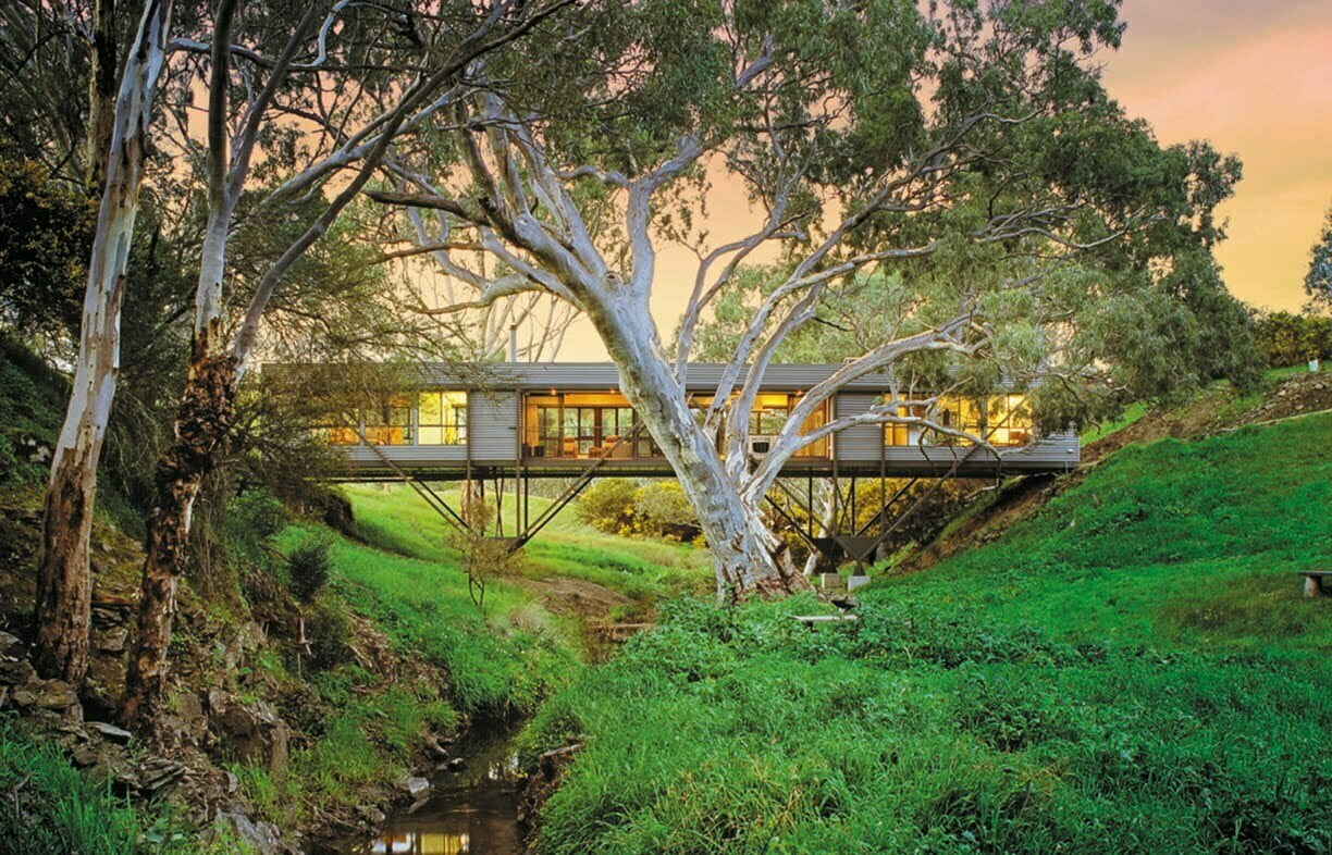
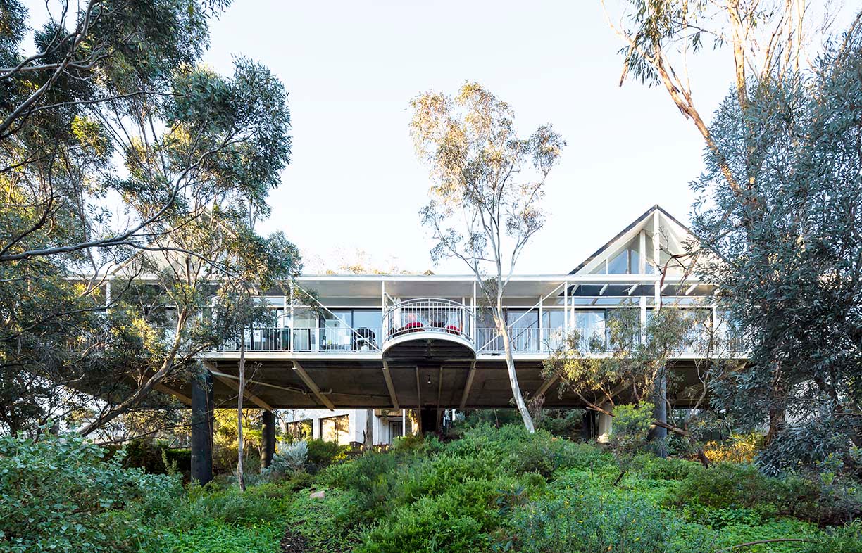
Known as the Bridge House for obvious reasons, the modest home on the cover of Sanctuary 8 is made spectacular by its novel location spanning a gully among magnificent gum trees in Ashbourne, south of Adelaide. Designed by architect Max Pritchard and completed in 2008, the innovative, lightweight structure touches the ground at just four points, minimising disruption to the creek bed below. Two steel trusses support an insulated, suspended concrete slab on which is built the Colorbond-clad, double-glazed home.
“I have always admired elegant bridge structures, devoid of ornament but beautiful,” says Max. “One of my first design projects was my own house, designed as a bridge suspended up to eight metres above the ground and with an expressed steel frame. Twenty years later I was presented with this opportunity to design a similar structure, this time with the added romantic notion of living over running water.”
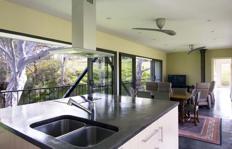
Long and narrow, the house was designed to make the most of views to both north and south. Summer cooling was by way of cross ventilation, shading and ceiling fans, and winter comfort was ensured by solar gain onto the thermal mass of the slab plus a small combustion heater. A 1 kilowatt solar PV system (which cost a whopping $20,000 at the time) and solar thermal hot water reduced the all-electric home’s grid energy needs.
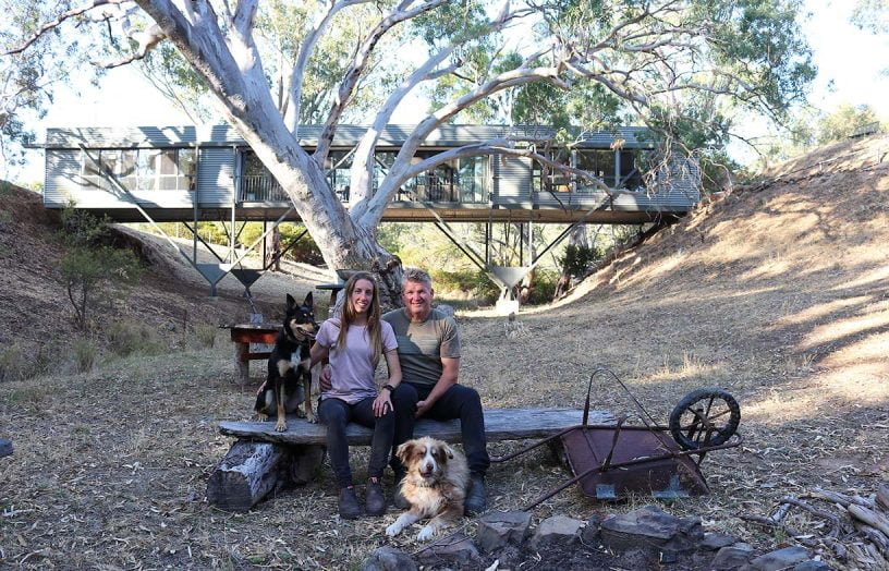
The original owners of the house having passed away, it’s been home to John Sexton and his partner Micarla since 2018. John has a building background and was very impressed with the structural design of the house and the quality of the build. “It’s weathered beautifully. When we moved in I cleaned the outside with a high pressure cleaner, and it didn’t reveal any issues or damage.”
The only change the couple has made so far is to put in new efficient ceiling fans, “which are really quiet and move the air around beautifully,” says John. The original solar PV system is still going strong, and will soon be upgraded to a 10 kilowatt system; John and Micarla are considering getting batteries and going off-grid for electricity in the future. They are also in the process of installing a sprinkler system in case of bushfires.
John reports that the house is lovely to live in. “There’s a real sense of elevation. We’re basically within the treetops, with nature around us: blue wrens, possums – it’s great for nature lovers like us.”
Read the original house profile, ‘Treetop vantage’, in Sanctuary 8.
Still making waves
Perched on a spectacular site overlooking the ocean in Port Fairy, western Victoria, the house that graced the front cover of the very first issue of Sanctuary back in 2005 was in many ways ahead of its time. It was designed by Andreas and Judy Sederof of Sunpower Design for Judith and David Phillips, and featured great insulation, careful design for both cross and stack ventilation, extensive use of recycled and sustainably sourced timber, and low-toxicity finishes wherever possible. It rated an impressive 8.1 Stars when it was completed in 2004.
The Phillips’ son Bradford was the driving force behind the sustainability features of the house. “At the time, the greenhouse effect of carbon dioxide was known, but emissions reduction was only just starting to be factored into the building industry,” he says. “My priority for my parents’ house was to combine passive solar design and energy efficiency with site-specific design that reflected a sense of place, given the house’s visibility from the beach.”
Pictured on that first cover, the curved double-glazed windows framing the mesmerising sea views to the east are one of the house’s most striking features. “The whole house is double-glazed, which was considered a bit of a luxury as it was very expensive back then,” says Andreas. He also recalls that at the time, sourcing materials that were sustainable, low in embodied energy and low-toxicity was a challenge. “We couldn’t get hold of much in Australia; we had to get materials from overseas. Now, though, there are a million options.”
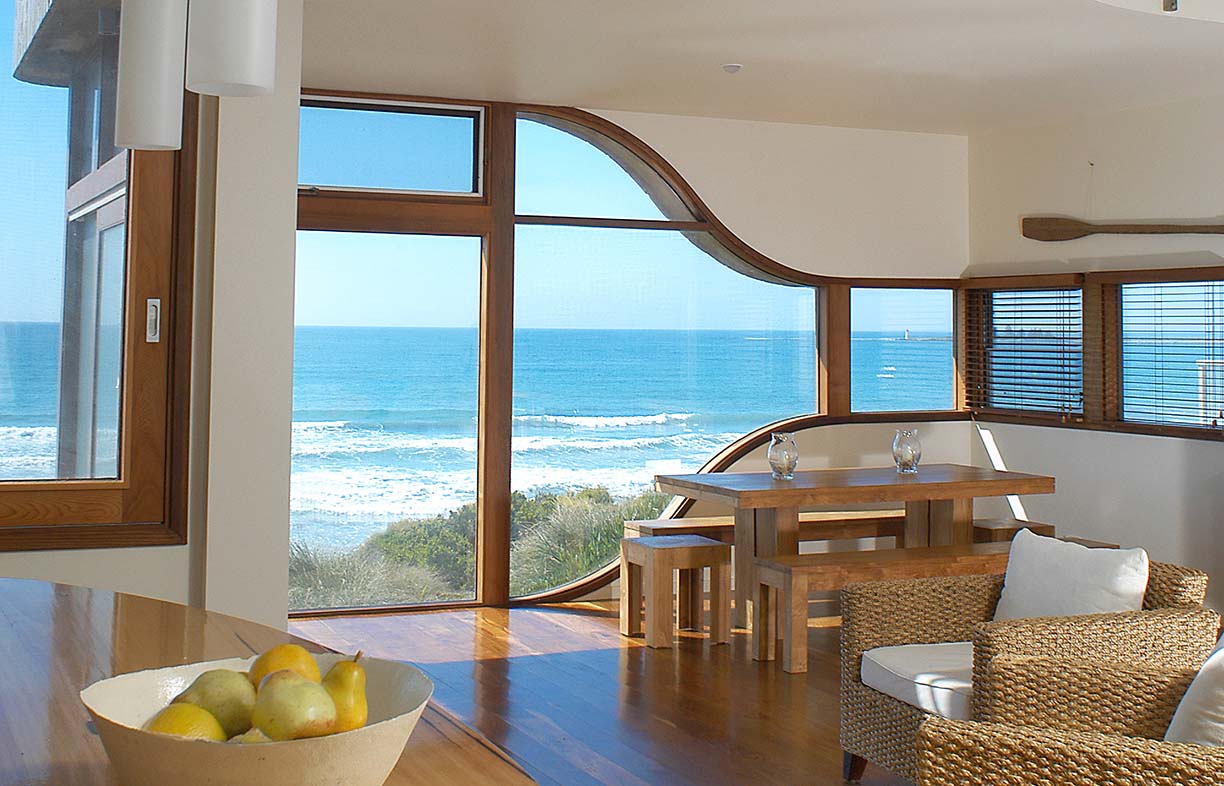
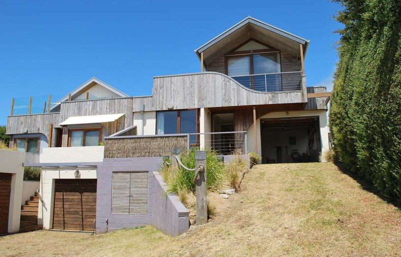

Sadly, David has passed away but Judith still regularly uses the holiday house. Her favourite features are the views from every aspect, thanks to the clever window positioning, and the green roof on the garage. “The grasses on the garage are rather special. They improve the outlook, and it was exciting to have a pair of wild ducks nest there one season.”
She says the home has always performed very well thermally, with an even internal temperature and great airflow for hot summer days. She also notes that the house is so well sealed that it doesn’t really get dusty, reducing the need for cleaning.
The house remains one of Andreas’ favourites. “Of all the five hundred or so houses we designed in our careers, there were just a handful, including this one, that when you walk in you just relax – there’s a lovely sense of harmony and peace.”
Read the original house profile, ‘Making waves’, in Sanctuary 1.
Top End triumph
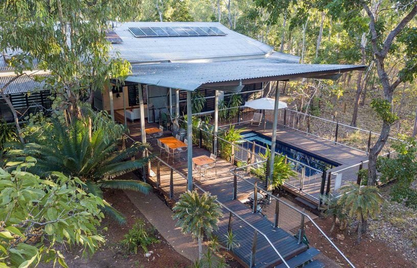
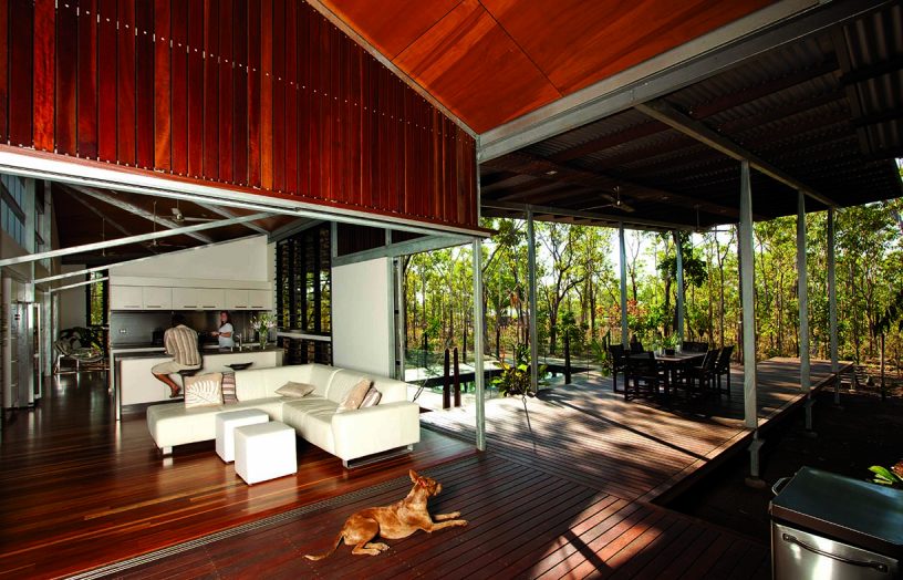
One of the editorial team’s favourite tropical-climate houses profiled in the magazine, Geraldine Lee and Kristian Mortlock’s Darwin home featured in Sanctuary 16 and was designed for comfortable living in the tropics without air conditioning.
“We wanted a sustainable home that was built for the climate and had a vernacular look and feel about it,” recalls Kristian. “We were keen to remove the dependence on air conditioning and let elements such as shading, orientation and passive cooling form the design aesthetic. [Local design practice] Troppo are famous for this type of design so they were an obvious choice.”
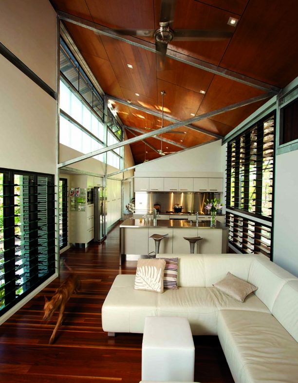
Owner-built by Kristian with help from his father and friends and completed in 2011, the airy, steel-framed house was designed to take every opportunity for natural cooling. Only one room wide for good cross ventilation, it forms one arm of a cruciform shape; an extensive deck forms the other arm, its 85 square metres more than doubling the living space. Interior spaces soar to five metres, louvres are everywhere and perforated steel sliding screens – fabricated by Kristian, a metalworker – open the living room onto the deck. A narrow pond was installed on two sides of the bathroom, cooling the breezes that blow across it and through the house. The external walls and roof were made from corrugated Zincalume and fibreglass, lightweight materials that don’t hold heat, instead cooling quickly after sundown.
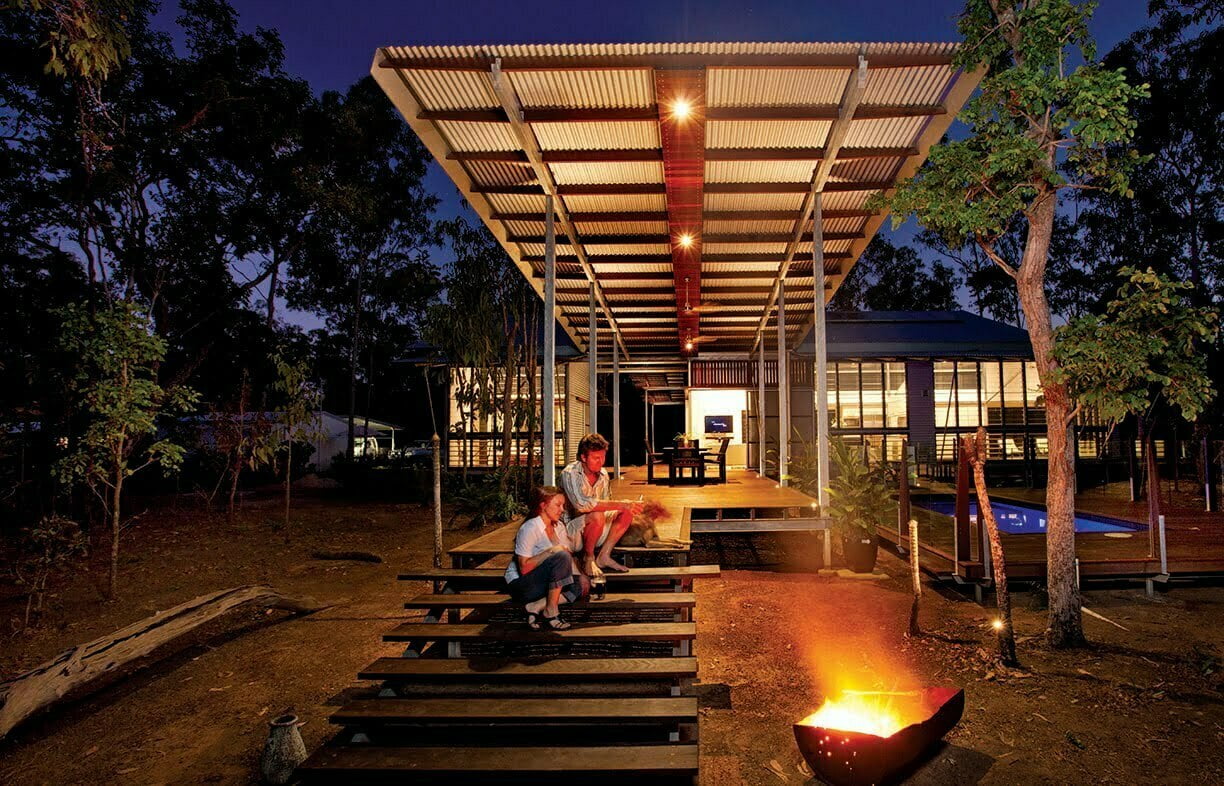
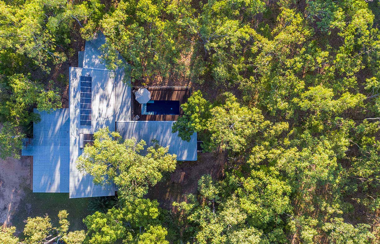
Kristian and Geraldine were joined some years after the completion of their house by their daughter, now aged seven. “Living in this house did take some adjustment, but it allowed for full immersion in the surrounding environment: amazing stuff like the wildlife, storms and crisp dry season nights,” says Kristian. “The complete openness means that no matter how warm the evening starts it will always be cool and comfortable inside come morning.”
The house has fared well during several relatively mild cyclones over the years. “The open nature of the house even when it’s ‘closed up’ enables it to breathe, and doesn’t allow any potentially damaging pressure buildup,” explains Kristian. However, he says that if he was designing the house again, he would factor in a safe space to provide protection in a substantial cyclone, probably doubled as standalone guest accommodation.
Once he finished the build, Kristian put down his metalworking tools and studied a bachelor of architectural design; he plans to undertake a master’s degree next year. “My aim is to take my sheet metal skills, design studies and experience of living in this amazing home into my future career,” he says.
Read the original house profile, ‘Tropical heat’, in Sanctuary 16.
Further reading
 House profiles
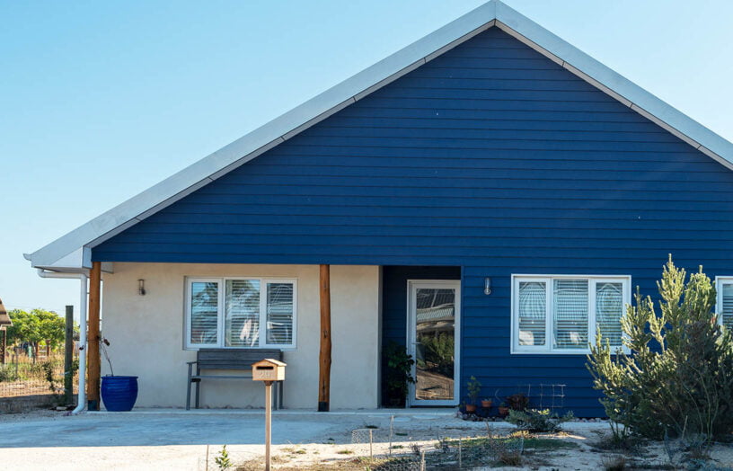
New beginnings
Catherine’s new hempcrete home in the Witchcliffe Ecovillage, south of Perth, offers her much more than simply a place to live.
Read more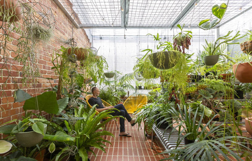 House profiles
Greenhouse spectacular
This Passive House is comfortable throughout Canberra’s often extreme seasons, and has a greenhouse attached for year-round gardening.
Read more House profiles
Like a charm
A smart renovation vastly improved functionality and sustainability in this small Melbourne home, keeping within the original footprint and retaining the cute period character.
Read more