Mid-century modest
At a glance:
- House retained and upgraded instead of being knocked down
- New living space added while keeping as much garden space as possible
- High windows for light and cross ventilation
- Services area to the west provides a buffer against hot afternoon sun
- Mid-century character of the home preserved
Preserving the essence of a 1950s home in Adelaide – while improving its functionality and performance – was the key to success for this budget-conscious extension project.
The mid-century brick house that Megan Warin and Cameron Barr bought in 2009 for their family of four, including two daughters aged four and nine at the time, was a bit of a rough diamond. In fact, it was slated for knocking down and rebuilding, but they could see potential in it. “We were lucky with this house because nobody else wanted it,” recalls Megan.
“We liked it and thought it was cool, but it had this strange quirk – a single room on top of the garage,” adds Cameron. They called it the Fonzie room, named for the lodger in 1970s TV show Happy Days, who lived in a similar apartment. “We used it as a rumpus; the kids played up there; and I’d watch the World Cup soccer at 4am and sleep on the spare bed.”
While useful, the Fonzie room was only accessible via an outdoor staircase, and eventually Cameron and Megan began to consider how they might integrate it into the main house. “We really needed more space and for the house to function better, both thermally and in terms of useability,” says Megan.
By serendipity, they met parents at their daughters’ school who were architects, and a long conversation ensued with Anne Taylor and Michael Buchtmann of Taylor Buchtmann Architects (TBA). “There was a lot of back and forth, an enormous amount of discussion at the early stages,” Anne recalls. “That’s when we find out more about our clients and it’s really useful; it means we are exploring lots of options at the beginning.”
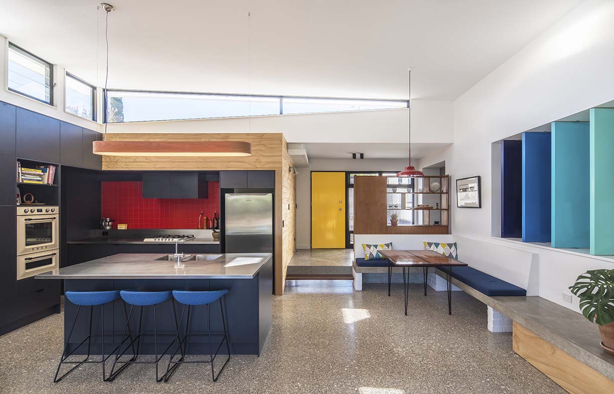
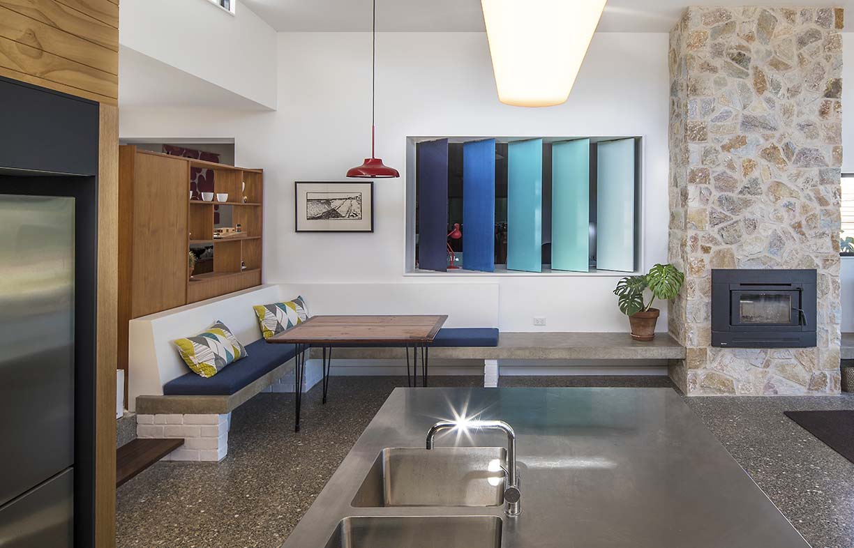
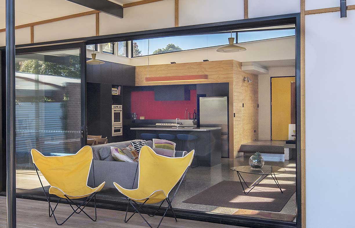
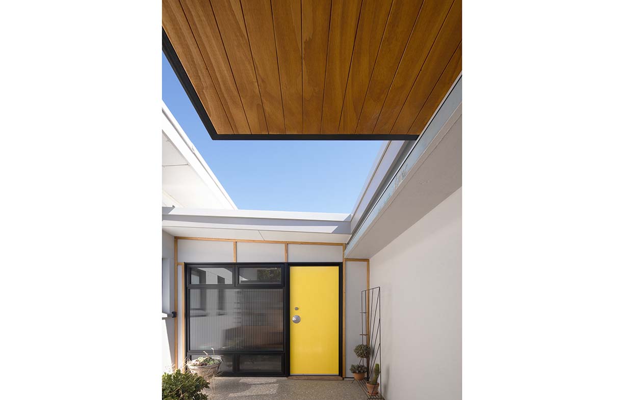
The architects developed a plan to connect the Fonzie room via a new addition, but it proved well outside the couple’s budget, so they had to reassess. In the end, the upstairs room was removed and a new single-storey open-plan living space was fitted between the garage, main house and pool. A bright yellow front door opens from the mid-century styled entry court into this new space, which contains kitchen, living and dining areas.
The high raked ceiling follows the roofline of the main house and terminates with a wrap-around clerestory window to the sky. “The high window to the north is one of my favourite parts of the new room,” Cameron says. “Sometimes it’s a wedge of blue, other times it’s grey and angry, but it’s always changing.”
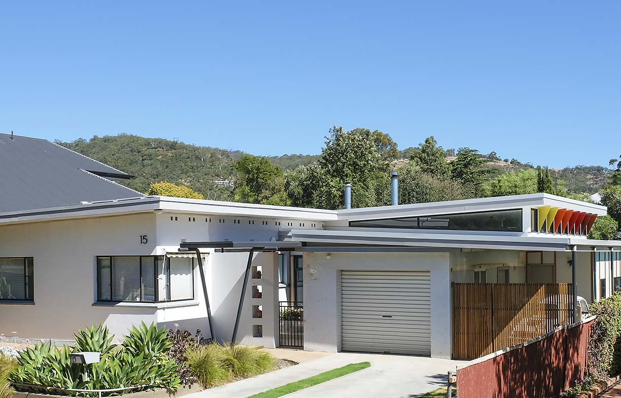
The western part of the clerestory is protected by a series of brightly coloured fixed awnings, angled to keep the western summer sun out of the room and to maximise warming afternoon sun in winter. High-level louvres also help to channel prevailing breezes through the space.
“When Michael and Anne asked us what we wanted, I told them I love having a breeze blowing through the house,” Cameron explains. “I love those summer evenings when we open the big door at the back – it has a retractable flyscreen – and the louvres, and the gully breezes flow right through. We don’t have any air conditioning in the new part of the house.”
Those breezes come across the pool, so they are naturally cooled; an inexpensive but functional bit of design thinking which paid dividends on Adelaide’s hottest ever day: the mercury topped 47 degrees Celsius in January 2019, yet the house stayed relatively comfortable.
“It was warm inside, but not unbearable,” Cameron says, “because we had the fans going and the air movement meant that it was okay.” In winter, the new room is heated using the slow combustion fireplace from the old loungeroom, now a study; blue-toned internal shutters between these spaces can be opened or closed to regulate the flow of air as well as noise and privacy.
The original part of the house is now a bedroom wing. A new main bedroom occupies the former kitchen and dining rooms, and the old laundry was given new life as Cameron and Megan’s ensuite. The front bedrooms and bathroom were largely untouched, although some light fittings and door handles from the Fonzie room were reused throughout, to help retain the original character.
In keeping with the “doing more with less” philosophy that underpinned this entire renovation, the new footprint added just 80 square metres to the compact house. “One of the things we look at first is how much we can keep, because it’s terribly wasteful to get rid of something that you can make functional,” Anne explains.
And while the new addition may be modest in size, it packs in plenty of design smarts that make it look simple, and as if it’s always been there. A concealed spine along the western edge – below the orange-toned shades – provides a buffer against afternoon sun and contains service spaces including a pantry, a laundry and a bathroom that opens directly to the pool area.
By carefully inserting the new living space amongst the existing structures, Anne and Michael were able to preserve and provide better connections to the established rear garden. “In the original house, we had no way of looking out to our beautiful backyard, so it’s lovely to be in that new room, in summer or winter, and to watch the rain or wind move through out there,” Megan says.
“It probably would have cost us the same price to knock down and rebuild, but we couldn’t have achieved that same financial result and also get the style we wanted,” Cameron says. “We didn’t want a project home; we like the character of mid-century homes.”
Luckily for the owners, they met architects who have an interest in working in the sector of the market between project and bespoke homes. “Also, Michael’s background is in apartment design. We aim to bring together skills from all those areas, and tease out the ways that project homes are built so cheaply, to find ways of delivering value for our clients,” Anne says. “We tend to work hard to achieve a robust plan that is doing a lot of things, that looks simple.”
“Our approach is egalitarian,” Michael adds. “We would like to see all people benefit from good architecture.”
For Cameron and Megan, a serendipitous conversation that started at their children’s school – and which took place over several years before construction commenced – has helped them realise the potential in their rough diamond. And they couldn’t be happier with the outcome
Further reading
 House profiles
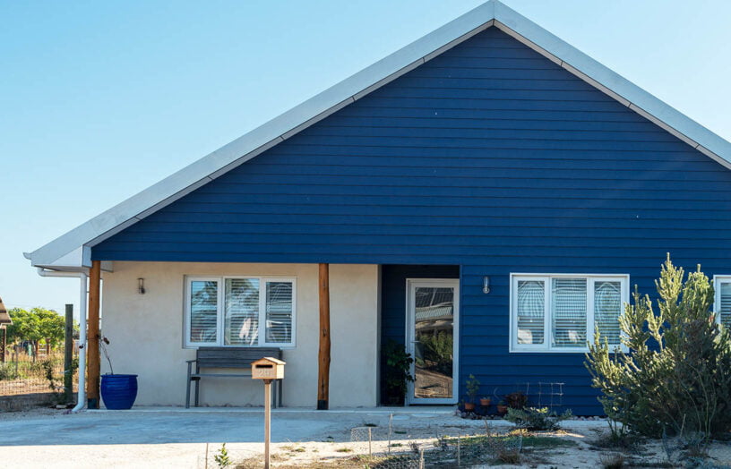
New beginnings
Catherine’s new hempcrete home in the Witchcliffe Ecovillage, south of Perth, offers her much more than simply a place to live.
Read more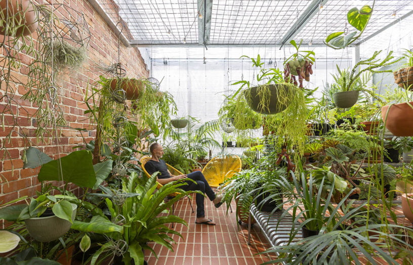 House profiles
Greenhouse spectacular
This Passive House is comfortable throughout Canberra’s often extreme seasons, and has a greenhouse attached for year-round gardening.
Read more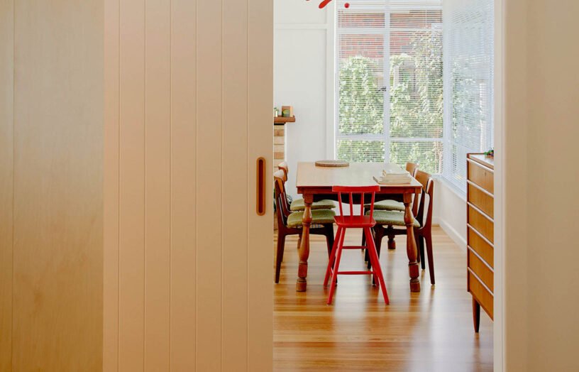 House profiles
Like a charm
A smart renovation vastly improved functionality and sustainability in this small Melbourne home, keeping within the original footprint and retaining the cute period character.
Read more