Sitting pretty
This sustainable addition to a period brick home in Melbourne’s inner north is carefully considered to be respectful of the original building, its immediate neighbours and its wider urban context.
Adding an extension to a period home in a way that’s sympathetic and enhances its liveability is always a design challenge. For Donna and Michael’s early 20th century house in Melbourne’s inner north, adding to the complexity of the brief was the small block size, its exposed street corner location in a densely built urban environment, and the fact that a large part of the design process had to be done remotely as the clients were living overseas.
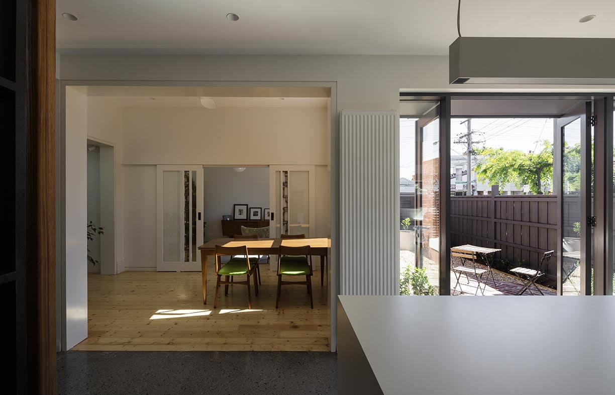
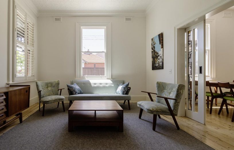
Working in international development, Donna and Michael spent 10 years living in Tanzania and Thailand before moving their base back to Melbourne. They bought their North Fitzroy house sight unseen in 2012. “We knew the area well and were specific about what we wanted: an old house with character, and some garden space,” explains Donna. “We had seen a lot of dark ‘tunnel’ type terrace houses, and were drawn to this one because it was different from that.” Semi-detached, the double brick original house had two bedrooms, a living room and a dining room plus a 1980s lean-to kitchen and laundry at the back.
Unusually, most of the block’s open space is along the street frontages at the front and side of the house, with just a carport to the rear: this required special consideration of public and private outside areas.
Around 2014, while living in Thailand, the couple began the process of looking for an architect to rejuvenate the house and add a new kitchen, bathroom and main bedroom. Wanting someone who had completed similar projects locally and “understood the built environment of the area”, they chose Antony DiMase, based just around the corner.
“Michael and Donna’s brief was not a specific one, but more of a discussion about how to add new spaces while respecting the original building and integrating the new with the old, keeping everything clean, functional and pragmatic,” says Antony.
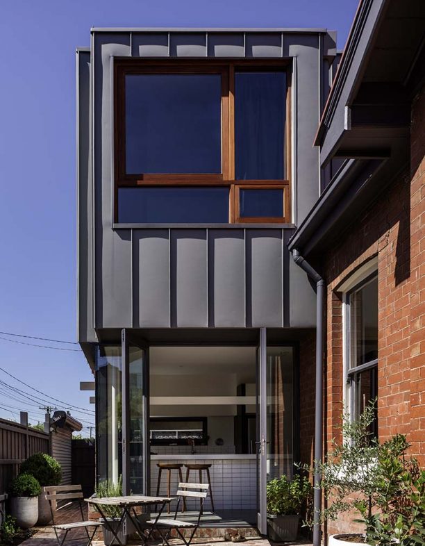
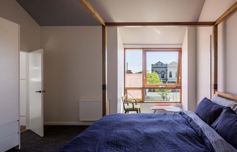
With the aim of retaining as much of the original house as possible, demolition was limited to the lean-to kitchen. Antony designed a two-storey addition to sit in its place, housing a new kitchen and bathroom with laundry on the ground floor, and a bedroom with ensuite upstairs. Because of its location on an exposed corner site, the design of the addition required considerable thought. “I was conscious of scale and the way it sat on the block,” explains Antony. “The main thing was to do the right thing by the house and the street – to be quiet, restrained and purposeful, not showy.”
The final design incorporates a concrete slab, ground floor walls built from brick reclaimed from the demolition, and an upper storey with an asymmetrical gabled roof that both maintains sunlight to the southern neighbours and reflects the shapes and forms of the original house. “We chose zinc cladding for the roof and walls of the upper storey, allowing for crisper detailing around windows, gutters and fascias,” says Antony. “Over time the zinc will take on a patina as it weathers that will enrich the facade.” It’s also long-lasting and requires no maintenance.
Donna and Michael are very pleased with the finished house, which also functions as office for both of them when they are not overseas for their work. “It’s a very easy house to live in – the spaces work well,” says Donna. “I was concerned that it would still be a very small house, but it actually feels quite spacious because of all the light and the high ceilings.” It works well thermally too; the couple says that the downstairs stays cool through the hot days of summer, aided by good cross ventilation and night purging of warm air. A small reverse-cycle air conditioner helps upstairs.
And far from feeling exposed on their corner, they have found that they love the connection with their surroundings. “The windows downstairs were all about light and views to the garden, but there are more views further afield than we’d thought about. I really like the glimpses down the nearby streets,” says Michael.
Antony is happy with the outcome too. “I think it’s the best fit for the demands of the site – the clients, builders, council and neighbours are all happy. It’s a responsible building, sitting in a complex urban environment without making a huge statement, yet still taking on the challenge of being a serious piece of architecture.”
Recommended for you
 House profiles
Doing things differently
Grappling with housing unaffordability, two Sydney friends pooled their resources – and tapped into family connections – to realise their home ownership goals.
Read more House profiles
A home for generations
With a modest extension and smart upgrades, this Canberra home is now far more comfortable and ready to evolve with the family’s needs.
Read more House profiles
Flipping the narrative
This Perth family threw out their original oversized volume builder plans and opted instead for a compact, healthy, sun-filled home with a big garden.
Read more